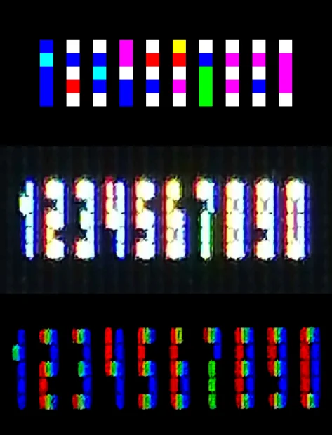
single-pixel wide subpixel bitmap numerals


single-pixel wide subpixel bitmap numerals


single-pixel wide subpixel bitmap numerals
Sans Forgetica is more difficult to read than most typefaces – and that’s by design. The ‘desirable difficulty’ you experience when reading information formatted in Sans Forgetica prompts your brain to engage in deeper processing.
That painstaking process is similar to the technique Cobden-Sanderson and Walker used to create the Doves type, itself a confection of two earlier designs. Doves owes most to the type of Nicholas Jenson, a Venetian printer from the 15th century whose clear and elegant texts shunned the gothic blackletter favoured by print’s early pioneers. A few letters were added, and others redrawn. The arrow-straight descender of its lower case ‘y’ divides critics; purists lament the thick crossbar of the upper case ‘H’. Most people neither notice nor care. “No more graceful Roman letter has ever been cut and cast,” opined A.W. Pollard, a contemporary critic, in the Times. Simon Garfield, a modern writer, celebrates its rickety form, which looks “as if someone had broken into the press after hours and banged into the compositor’s plates.”